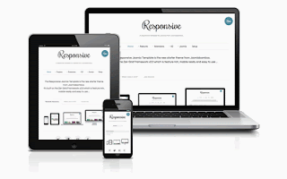
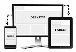
Responsive templates are getting more popular in 2013 , responsive templates makes your blog or website looks fine in across all types of screen sizes, it will suit your pc, laptop,mobile, ipad etc, responsive templates are good too for your site indexing .
See some popular responsive templates
Tip: try to resize any responsive template window gradually like our blogger jobboard responsive template and see the magic !
So responsive templates are very important for your site and for your adsense since adsense for mobile is no longer supporting high-end mobile devices and only adsense for content can be used for these devices .
But we still have a problem here adsense unites are not responsive and might not suit all widths of your template so parts of your adsense ad like the label of "adchoices" might be invisible and this violates adsense TOS and impact your adsense or cause your adsense account to be banned by adsense
Suggested Solutions
1-Use suitable adsense ad widths
"If you can`t make responsive adsense ad use suitable adsense ads"resize your template window to minimum width untill it stops responding to resize this would be the maximum width you can use for your adsense units
e.g if you re-sized this template to minimum width you will notice that it`s about 300px width so i used
Half Banner (234x60)
instead of Banner (468 x 60)
===============
2- make your adsense responsive (partially)
If you wanna add adsense ads side by side don`t use tables use "div" ,tables will not only make your ads overflow and violate adsense TOS but also might break your responsive template design
can use "div" unites instead of tables as follow
<div class="float:right">
adsense unit 1
</div><div class="float:right">
adsense unit 2
</div>
this will make adsense flow with your design partially
Update:
Make ad unit changes due to the size of the screen (responsive adsense) !
Due to the multiplicity of devices that can now visitor browsing the site of them (smart phones - Tablets - TVs smart - laptop computers - desktop computers) we need the adsense provide some adjustments that can be made on the subdivision advertising to interact intelligently measure the screen that is displayed on them.Example:
Want to show the ad unit size 90 * 728 if the screen display used by the visitor to browse your site 800 pixels or larger (suitable for screens of PC and Laptop), and to change to become a unit size 60 * 468 if the screen display is larger than 500 pixels (suitable Tablet screens), and become a unit 50 * 320 if the screen display is less than 500 pixels (suitable for screens Smart Phones)
Steps:
1 - Create 3 ad units with mentioned sizes.
2 - Copy the three codes of the units created and paste them into a text file.
3 - with all the code you'll find a line programmatically as follows:
google_ad_slot = "1234567890";
4 - Copy the Slot number on each code (without the quotes), and then paste it in place in the following code:
don`t forget to replace ca-publisher-xxxxxxxxxxxxxxxx with your own publisher code
<script type="text/javascript">
google_ad_client = "ca-publisher-xxxxxxxxxxxxxxxx";
width = document.documentElement.clientWidth;
google_ad_slot = "AAAAAAAAAA";
google_ad_width = 320;
google_ad_height = 50;
if (width > 500) {
google_ad_slot = "BBBBBBBBBB";
google_ad_width = 468;
google_ad_height = 60;
}
if (width > 800) {
google_ad_slot = "CCCCCCCCCC";
google_ad_width = 728;
google_ad_height = 90;
}
</script>
<script type="text/javascript" src="http://pagead2.googlesyndication.com/pagead/show_ads.js">
</script>
blogger templates blogger tips


